
Friday, 9 May 2014


Evaluation 7
Evaluation 7: Looking
back at your preliminary task, what do you feel you have learnt in the
progression from it to full product?
Comparing my preliminary task to my finished product, I can see a
considerable improvement and progression. The finished magazine looks like a
professional product, whereas the preliminary piece does not.
Masthead
The masthead on my preliminary piece only slightly follows the
conventions of a magazine. It covers almost all of the top of the page,
utilising the space well but it still does not look like a professional
magazine as the font is very cartoon like, and this does not reflect the tone
of the magazine.
My finished piece looks a lot more professional. The font is
large, clean and easy to read. I use the space well, covering the width of my
magazine with the masthead.
My masthead's text is placed behind my image which breaks the
conventions of a new music magazine. Newer music magazines tend to have the
masthead in front of the image because they are not well known, so the text
will stand out in the foreground. I chose the opposite of this because I want
my readers to see the exclusive interview by looking at the image first. It
also implies that my magazine is already established, and can catch the eye of
a reader who is looked for quality established magazines. I have learnt that
breaking conventions can sometimes be more effective than conforming.
Cover Images
The cover images of my preliminary look vastly inferior to my
finished product. My finished image has been meticulously edited, whereas my
preliminary image has only been cropped using the magic want tool. I have
learnt that a lot of work and care needs to be put into the image to achieve a
professional standard.
The image is a medium close up, but does not use the space well.
My image could have been moved to better display my models head instead of his
shirt and torso.
It would also have looked more effective if I had cleaned up the
edges better.
My final front cover image looks like a professional piece of work.
There are no white edges, and the contrast and colours of the image combine
with the lighting to make my models look as well presented as possible. I
learnt how to use layer masks from tutorials on the Internet, and learnt that
it is not enough to only use the magic wand tool. I edited the contrast and
levels of my image, achieving a natural lighting effect.
Contents Page
My preliminary contents page follows the house style of the
magazine. It follows the conventions of a magazine, using page numbers, an
editor’s note, and images from inside the magazine, but it is still very bare
and plain.
My finished contents page looks a lot more professional. I have
used a large, easily readable font for the title, following the house style of
my magazine. I use the magazine’s logo in the left corner in order to establish
and connote my brand. The font is a white, easy to read sans serif font, with a
black 2pt stroke outlining it, contrasting with the dark grey background. I
have learnt about the sizes of fonts and the editing techniques needed for the
pages to look professional. The font can not be too big as it will look
childish, and if it is too small it will be difficult to read.
I have used a variety of different images for my contents page,
featuring numerous different bands and artists. This shows the broad spectrum
of music features in my magazine, and also connotes an air of quality because
it shows I have interviewed multiple bands.
Evaluation 6
Evaluation 6: What have you learnt about technologies from the process of constructing this product?
I have used a variety of technologies and equipment when creating and constructing my media product.
- Camera: I used a digital nikon coolpix camera to take my photographs. I used the rule of thirds and researched shot composition before I took my photographs.

- Apple Mac: I used an apple mac computer throughout my entire construction process to create my artifacts, and to write blog posts.

- Adobe Photoshop: I became familiar with the nuances of photoshop and used the different tools to manipulate my image and edit the pages.

- Prezi: I used prezi to create unique presentations that contain zooming transitions and different themed templates.

- Blogger. I used blogger to present my work online to my peers, allowing me to gather feedback, and also show my piece to the world.

- Slideshare: Slideshare is an online presentation host which enables me to upload powerpoint presentations to the internet. I used it to upload my presentations.

- Soundcloud. I used soundcloud to upload my podcast that I had created using audacity.

- Audacity: I used audacity to create a podcast. I used multiple tracks to edit different parts of my voice, and inserted a backing track to create a professional sounding podcast

- Soundcloud. I used soundcloud to upload my podcast that I had created using audacity.
Evaluation 5
Evaluation: How did you attract/address your audience?
Front Cover:
My front cover uses direct address to immediately capture the attention of the audience. Direct mode of address is effective in engaging all types of audiences, not just my target audience.
The clothes of my models attract my target audience, and also their appearance. Free’s piercings connote the metal/rock genre, and fans of Metallica will recognize the shirt she is wearing.
I have used lots of buzzwords on my front cover, such as Win! Free! Exclusive! to draw my readers in. The effectiveness of these words are emphasised by the income bracket of my target audience. My magazine is low price, and my target audience wouldn’t have a lot of disposable income, so the free gifts and competitions appeal to them.
My magazine’s selling line “The UK’s best selling Alternative Magazine” is effective at
attracting the audience because it implies my magazine is well regarded and prestigious. This draws readers because they are looking for quality products.
Contents Page:
My contents pages attracts the audience through using direct mode of address, for instance the picture of the band Fall Before Us in the bottom right corner has their gaze focussed on the reader. The images I have used show a broad range of bands and artists, and some images show the bands performing in concert, which is effective in attracting my audience because I am targeting people who enjoy going to live music events.
Double page spread:
The poses and facial expressions of my models scream “Attitude”
This is effective because a lot of 16-19 year olds like to see themselves as rebellious and wild, and they can relate to the artists. the quote “Music is stale, we’re the future” is a radical statement that shows the band have their own firm opinions. My target audience like alternative genres which are less mainstream than the repetitive pop music which is played in the charts, so this statement that attacks pop music is relatable to my audience.
My target audiences likes to play musical instruments, and many of them would be in a band, so the questions and answers I have included in my interview appeal to them. For example, part of Free’s answer to my first question “2 years ago we were making music out of Will’s bedroom and busking in town- we’d be lucky if we made enough for the train fare home”. This answer attracts my audience because it shows that the band in my magazine started from the bottom, and my target audience will relate to this
Thursday, 8 May 2014
Sunday, 4 May 2014
Thursday, 24 April 2014
Editing images

This Image is used in my contents page to show the band featured in the next issue of my magazine. I used the magic wand tool to cut out the background. The tool is useful for removing large backgrounds quickly and easily, but is not very precise. Parts of the background remain, and make my image look sloppy and unprofessional. The background is particularly visible behind my model's heads. I used a layer mask to rectify this.

A layer mask allows me to use the paintbrush tool to paint out the background.

Friday, 11 April 2014


Tuesday, 1 April 2014
Front page improvements


The first image shows my old front page, and the second image shows my improved front page.
I have added cover lines to fill the blank space. This shows what is inside the magazine and attracts readers to look inside.
I have made the main article's font size bigger. This frames the picture and also becomes easier to read from further away, attracting the audience to read it.
I have increased the font size of the masthead and selling line. These need to be clearly visible, as the name of a magazine is one of the first thing's a reader looks at. I have moved the image to the layer in front of my masthead. This connotes that it is a reputable magazine, and that the name is easily recognisable and well known.
I have moved the price and issue number to the bottom of the page next to the barcode, which subtly makes the reader look at the whole page to see the price. This is because the large masthead and direct gaze attracts the reader's eyes, and they need to look down the page to find the price.
Tuesday, 18 March 2014
Response to audience feedback

Here I have improved my double page spread further by Increasing the size of the Image, which more clearly shows the models, Adding a small stand below the main article to introduce the band, and organising the questions into columns so that they are inline with the article. This is in response to my audience feedback.
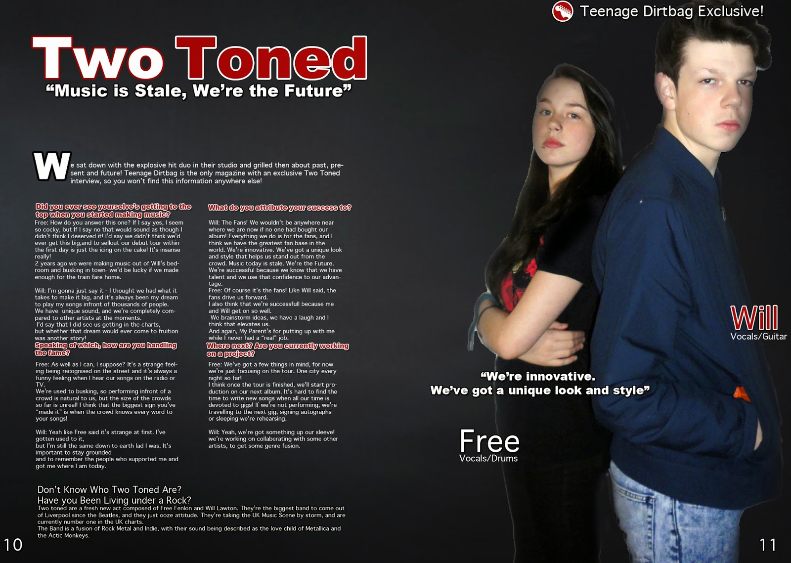
I have further improved my Double page spread by making the drop cap smaller, and the opening paragraph is now inline with the columns. I have also added text next to the images labelling them, making use of blank space
Tuesday, 4 March 2014
Editing techniques: Text Effects
I have used different text editing features to create a professional front cover for my magazine.


I used a stroke effect to outline the text with a contrasting colour, making it stand out on the black background. These screenshots show my text with and without a stroke. In the first Image, as the text encroaches into the black gradient it becomes harder to read. In the second picture, the stroke ensures that is easier to read and does not lose clarity.
I used a drop shadow to again contrast the background and make the text eye catching to the reader. The drop shadow gives the text weight, showing it's importance
I used a stroke effect to outline the text with a contrasting colour, making it stand out on the black background. These screenshots show my text with and without a stroke. In the first Image, as the text encroaches into the black gradient it becomes harder to read. In the second picture, the stroke ensures that is easier to read and does not lose clarity.
I used a drop shadow to again contrast the background and make the text eye catching to the reader. The drop shadow gives the text weight, showing it's importance
Monday, 3 March 2014
Audience feedback


Here I have collected audience feedback. I have asked for comments on my work, and have received constructive criticism about it. From these comments I have created a list of things I can improve on.
Improvements
- Add more cover lines to my front cover because it looks too bare
- Make the font bigger to better utilise the blank space on my front cover
- I need to change my photos on my contents page so that they are unique and varied. this is because I have used similar pictures on my contents pages. I will take new photographs of different models that are holding musical instruments to reenforce the the genre of my magazine.
- I can make the text on the opening sentence of my double page spread bigger to fill up the space and to draw attention to the the opening phrase. I can also make my image larger to cut the model's legs out of the photo, drawing attention to their upper body and face.
- I can improve my front cover by increasing the size of the masthead's font to make my brand more easily distinguishable on a shop shelf. I can also add more cover lines because my magazine's front cover is quite bare.
Subscribe to:
Posts (Atom)