Tuesday 18 March 2014

Response to audience feedback


Here I have improved my double page spread further by Increasing the size of the Image, which more clearly shows the models, Adding a small stand below the main article to introduce the band, and organising the questions into columns so that they are inline with the article. This is in response to my audience feedback.
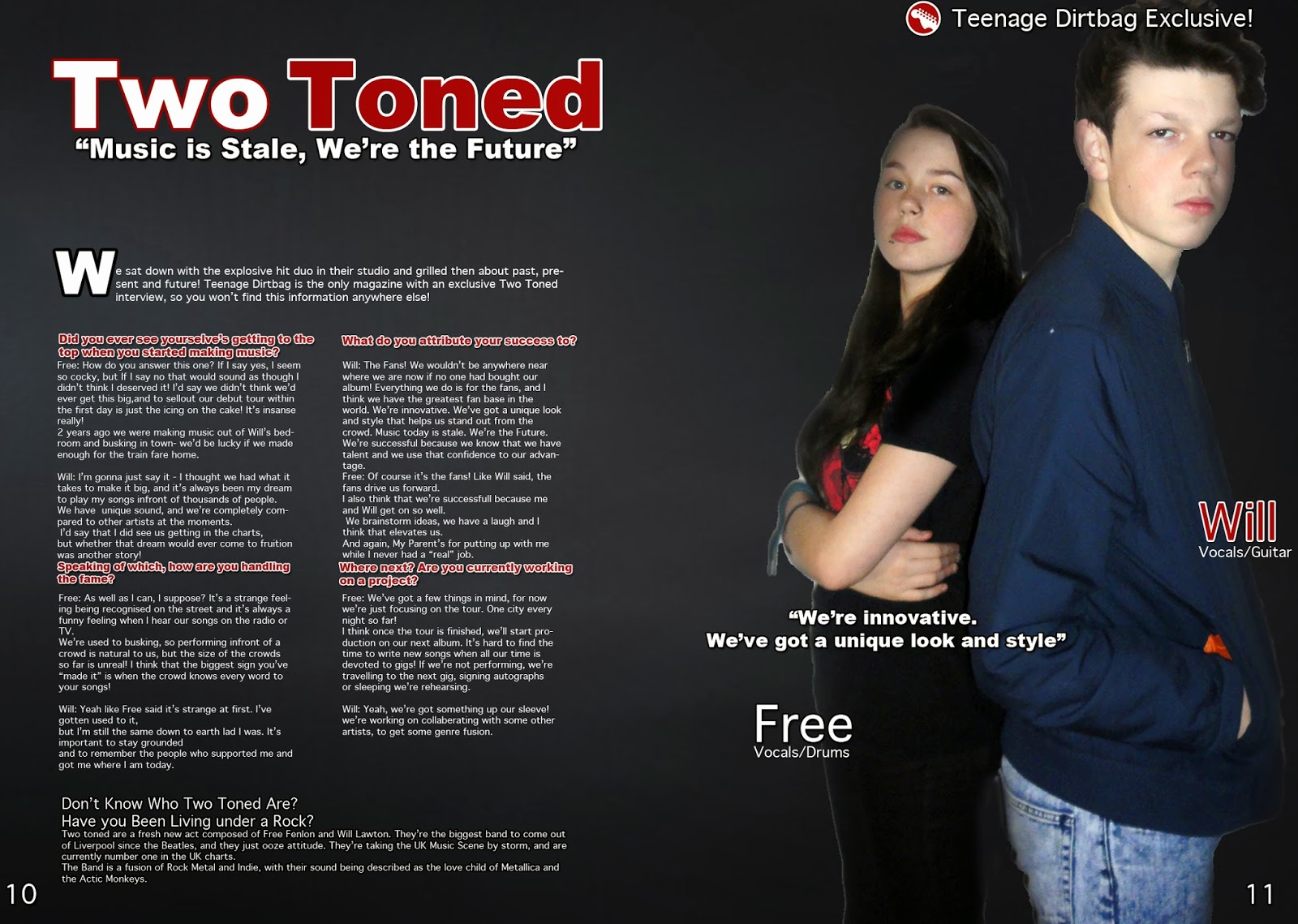
I have further improved my Double page spread by making the drop cap smaller, and the opening paragraph is now inline with the columns. I have also added text next to the images labelling them, making use of blank space

Tuesday 4 March 2014

Editing techniques: Text Effects

I have used different text editing features to create a professional front cover for my magazine.


I used a stroke effect to outline the text with a contrasting colour, making it stand out on the black background. These screenshots show my text with and without a stroke. In the first Image, as the text encroaches into the black gradient it becomes harder to read. In the second picture, the stroke ensures that is easier to read and does not lose clarity.

I used a drop shadow to again contrast the background and make the text eye catching to the reader. The drop shadow gives the text weight, showing it's importance

Monday 3 March 2014

Audience feedback


Here I have collected audience feedback. I have asked for comments on my work, and have received constructive criticism about it.  From these comments I have created a list of things I can improve on.

Improvements
  • Add more cover lines to my front cover because it looks too bare
  • Make the font bigger to better utilise the blank space on my front cover
  • I need to change my photos on my contents page so that they are unique and varied. this is because I have used similar pictures on my contents pages. I will take new photographs of different models that are holding musical instruments to reenforce the the genre of my magazine.
  • I can make the text on the opening sentence of my double page spread bigger to fill up the space and to draw attention to the the opening phrase. I can also make my image larger to cut the model's legs out of the photo, drawing attention to their upper body and face.
  • I can improve my front cover by increasing the size of the masthead's font to make my brand more easily distinguishable on a shop shelf. I can also add more cover lines because my magazine's front cover is quite bare.

Sunday 2 March 2014

Updated Double page spread.


I have updated my page spread further so that it looks as close to a real magazine as possible. I have organised my text into columns so that it looks more like my style models and competitions. I have moved the pull quote over to the right next to the picture the emphasise the pose of my models. I have used the words "Teenage Dirtbag Exclusive" one the top right of my page because this will be the first thing my audience see's as they flick through the pages and it will catch their attention.
Any Feedback will be appreciated and considered so please comment.